Introducing Green Check Verified Version 2.0

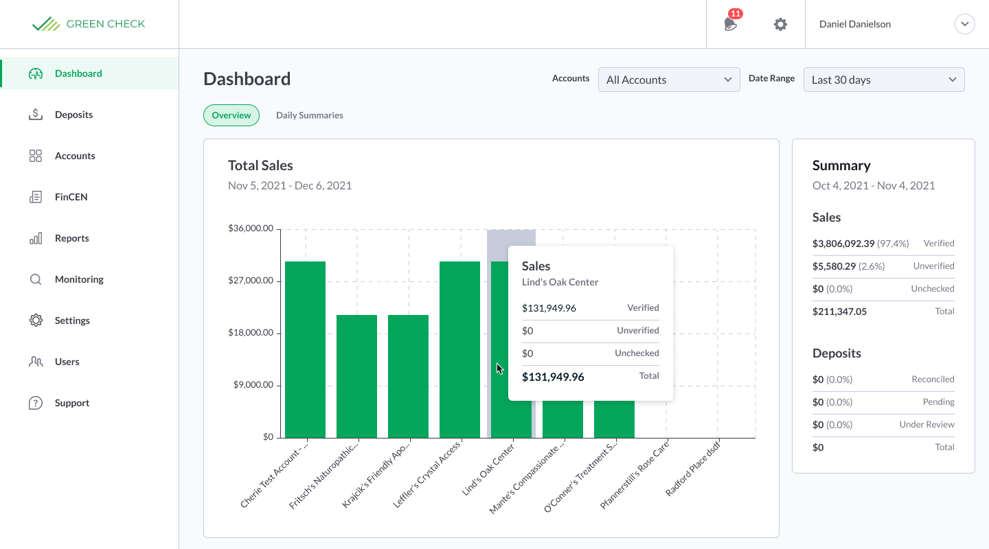
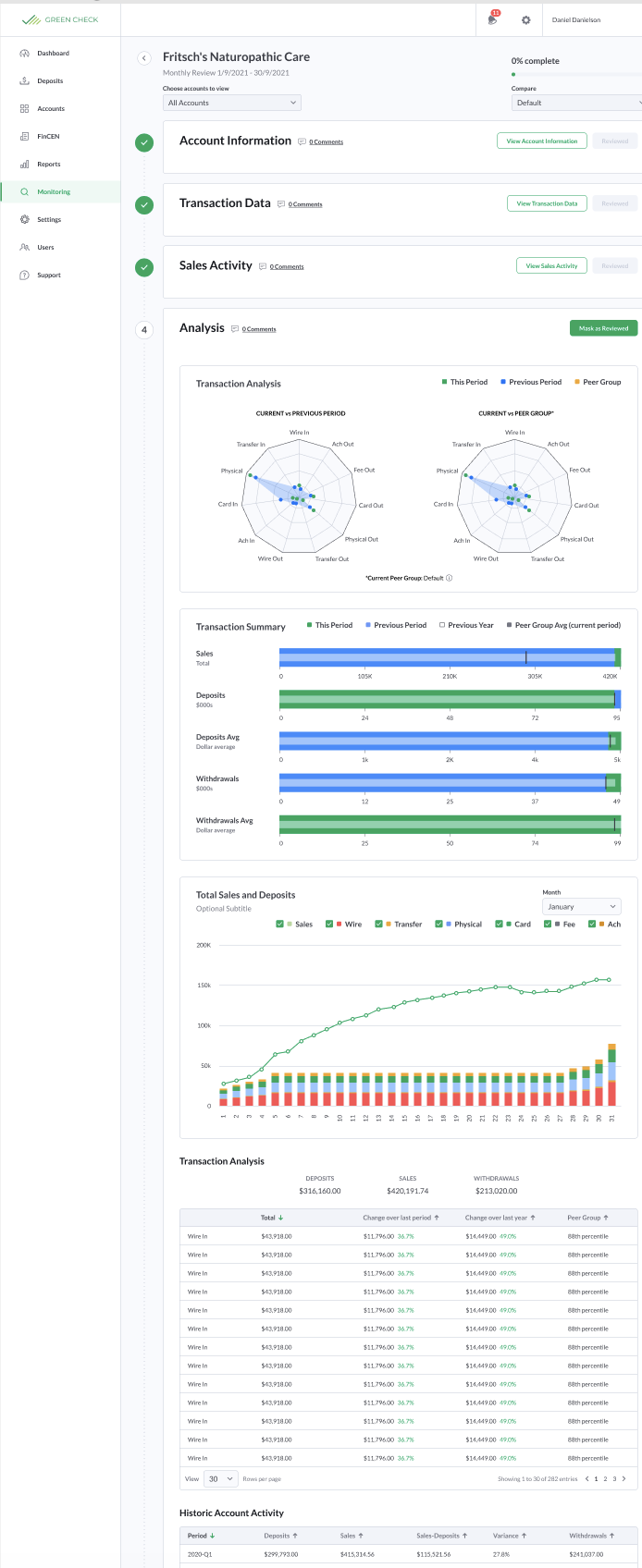
This week, Green Check launched the newest version of our application, Green Check Verified Version 2.0. We rebuilt our entire front-end code base, focused heavily on improving the user experience, and included a ton of product enhancements making it worthy of the second iteration of our product. A normal dot release just wouldn’t cut it for this one!
As the director of product, I want to take a step back and reflect on this project: why we did it, what we gained, and what we are looking forward to in the future as a product-led company.

Moving to a scalable framework
Although I don’t want to get too technical in this blog post, I want to mention why we decided to embark on this journey to rebuild our front-end code base. A beautiful, usable user interface sometimes isn’t enough; it needs to be built in a way that is scalable, resilient, and efficient. This is why we decided to take the plunge and move our code base to ReactJS. ReactJS is a mainstream code library that uses reusable components, which makes our application easier to develop and maintain while giving it a consistent look and feel across all pages. Reusable components are a major benefit, as they provide standardization and predictability between pages on the app. For instance, having the same date picker in the same location across pages means you always know where to go when choosing a time period.
Moving to a reusable component library was a smart move at this juncture—we have so many features and products in the short and long term roadmap, and we want to ensure they can be built as quickly and efficiently as possible by our wonderful development team! Facebook, Netflix, and Tesla all use React, so I think we’re in good hands.
Hyper-focused on the user experience
As a product-led company, every single team and each employee at Green Check is collectively focused on the same end goal—ensuring that we deliver as much value to our clients with every iteration. We collect product feedback, use analytics to spot pain points, and put ourselves in the seats of our users as we make product decisions. We listen and we invest heavily in our product development efforts. I think our clients would agree that our application truly shines amongst the other banking software they might be used to!
This is why the user experience was top-of-mind as we rebuilt Green Check Verified Version 2.0. We wanted to make sure we were not just releasing a shiny new user interface, but rather, a usable one with less clicks, reduced frustration, and increased happiness. I love when products delight me in my everyday life, and I want Green Check’s product to have that same delightful effect on our clients.
Focusing on the future of Green Check
As I mentioned earlier, our newly rebuilt front-end code base allows us to develop products quicker and more efficiently, which sets us up perfectly for the remainder of 2022 and beyond. We have BIG features in our pipeline that will help our clients not only focus on their existing direct cannabis relationships, but also scale their programs to support indirect cannabis businesses as well.
We want you to have the tools needed to automate your program so you can focus on growth, monitor your accounts while spotting trends and anomalies, and communicate with your cannabis relationships seamlessly from within our application. Our comprehensive Due Diligence, Compliance Rules Engine, FinCEN Reporting, and Account Monitoring features are a great foundation for any cannabis banking program; however, we are taking the platform to new heights and we can’t wait for you to see what’s in store!
